UI/UX Audit Checklist: Fix Drop-Off and Increase Conversions
By Relish Team
UI/UX Audit Checklist: Fix Drop-Off and Increase Conversions
If your website or app is getting traffic but not converting, the issue is rarely “more ads.” Most of the time, the real problem is the user experience.
People land on your page, hesitate, feel confused, and leave. Not because they hate your product, but because the journey feels slow, unclear, or hard to complete. That’s exactly what a UI/UX audit is meant to fix.
In this blog, you’ll get a complete UI/UX audit checklist you can use to find conversion blockers, reduce drop-offs, and improve user flow without rebuilding your entire product.
What is a UI/UX audit (and why it impacts conversions)
A UI/UX audit is a structured review of your website or app to identify design and experience issues that reduce engagement, trust, and conversions.
It focuses on how real users experience your product, including where they:
- get confused
- hesitate
- abandon forms
- bounce too quickly
- struggle on mobile
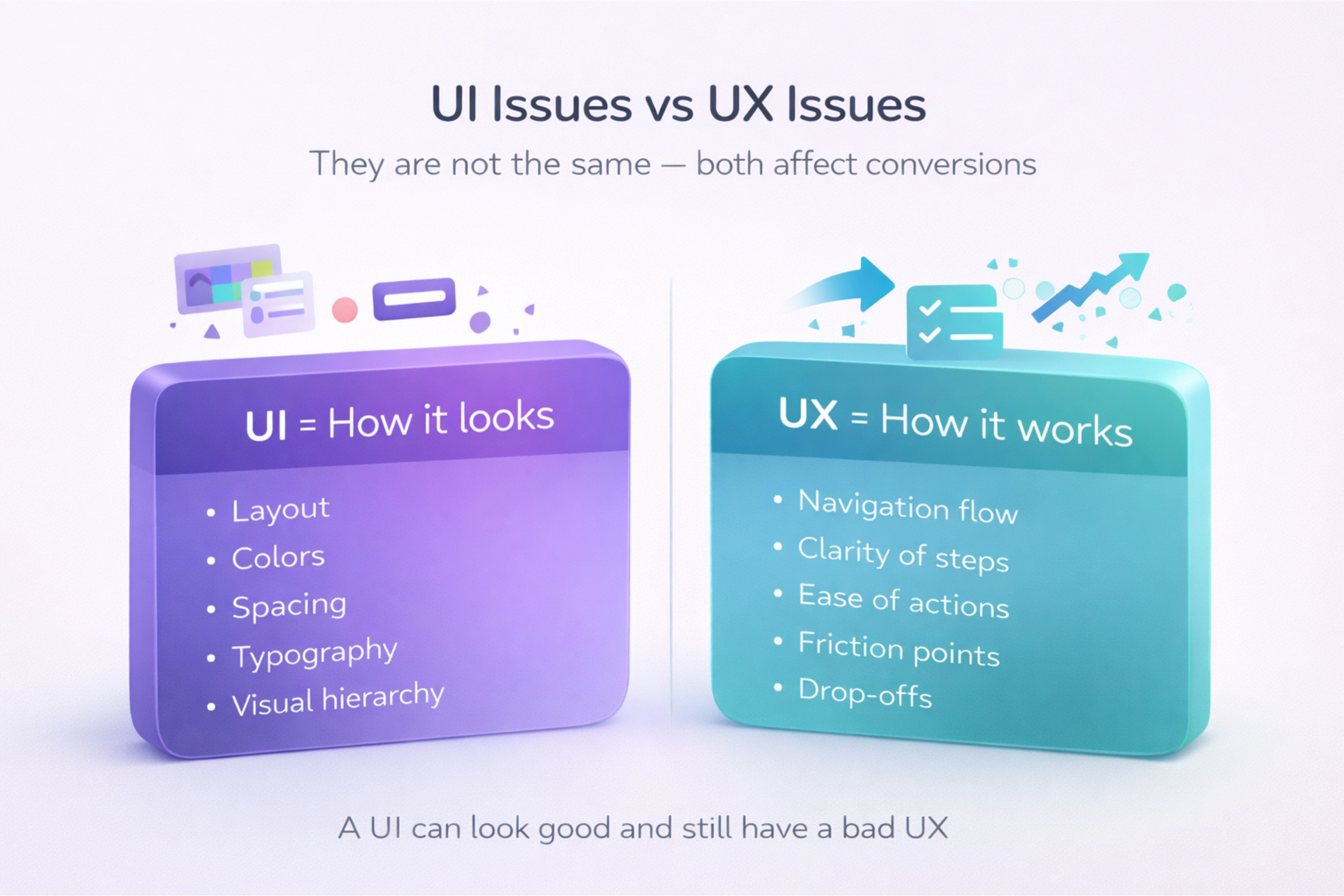
UI issues vs UX issues (simple difference)
Both matter, but they are not the same.
UI (User Interface) includes how things look:- layout
- colors
- spacing
- typography
- buttons and visual hierarchy
- navigation flow
- clarity of steps
- ease of completing actions
- friction points and drop-offs
A UI can look good but still have a bad UX.
When you should run a UI/UX audit
A UI/UX audit is useful when:
- your traffic is increasing but conversions are not
- users start actions but don’t complete them
- bounce rate is high on key pages
- users complain “it’s confusing”
- your product has grown but design feels inconsistent
- mobile users drop more than desktop users
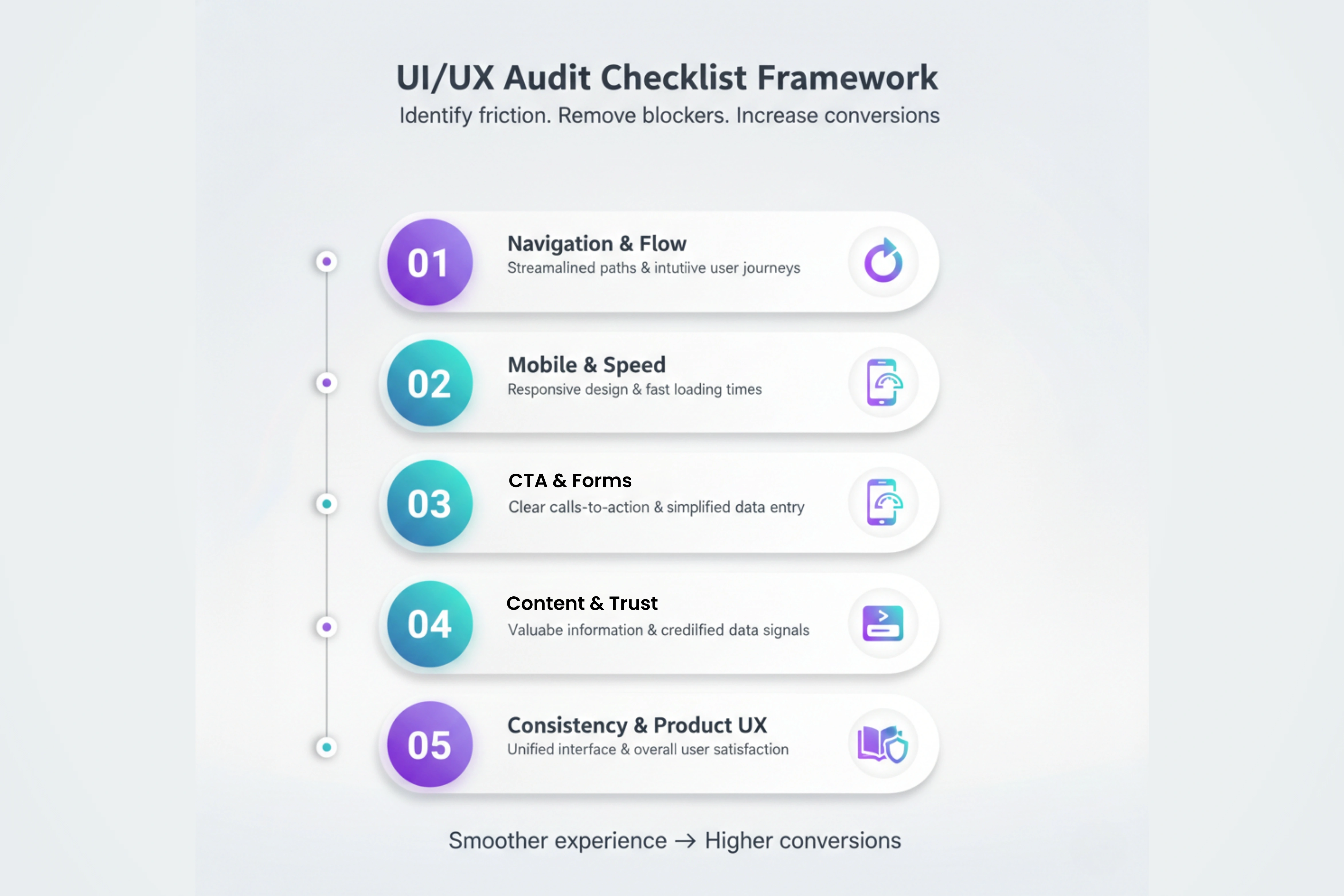
The UI/UX audit checklist (step-by-step)
Use this checklist like a real-world process. You don’t need to fix everything at once. The goal is to identify what’s hurting results and prioritize changes that improve conversions quickly.
1) Navigation clarity and user flow
Start with the simplest question:
> Can a new user understand what to do in the next 5 seconds?
Check:
- is the main navigation short and clear?
- do users understand your product or service quickly?
- is your primary CTA visible without scrolling?
- do key pages connect logically (home → service → contact)?
- do users get stuck between steps?
Fix signs:
- too many menu items
- unclear labels like “Solutions” or “Explore” with no direction
- no clear “next step” on pages
2) Mobile experience and layout issues
Mobile is not a smaller desktop. It’s a different user mindset.
Audit:
- text size readability
- spacing between buttons
- sticky headers blocking content
- forms and dropdown usability
- tap targets (buttons too small)
- sections that look “broken” on mobile
If users struggle on mobile, they won’t convert no matter how good your offer is.
3) Speed, load time, and visual stability
Slow experiences kill conversions silently.
Check:
- page load time on 4G
- image sizes and heavy animations
- layout shifts while loading
- unnecessary scripts slowing pages
Even a 1–2 second improvement can change conversion rates.
4) Call-to-action (CTA) clarity and placement
Your CTA should feel like the obvious next step, not a guess.
Audit:
- does your CTA match user intent?
- are CTAs consistent across pages?
- do buttons explain the action clearly?
- is there one primary CTA or many competing ones?
Better CTA examples:
- ✅ “Schedule a consultation”
- ✅ “Request a proposal”
- ✅ “Get a custom quote”
- ❌ “Submit”
- ❌ “Click here”
- ❌ “Proceed”
5) Forms and lead capture friction
Forms are where conversions are won or lost.
Audit:
- how many fields are required?
- is the form easy to complete on mobile?
- does it show errors clearly?
- does it confirm submission properly?
- does it build trust near the form (privacy, reassurance)?
Quick improvements:
- reduce fields
- use clear input labels
- show success confirmation
- add microcopy like “We reply within 24 hours”
6) Content clarity and scanning experience
Even great content fails if it’s hard to scan.
Audit:
- are paragraphs short?
- are headings meaningful or generic?
- is your value clear above the fold?
- do you use bullets for quick understanding?
- do key benefits feel specific or vague?
Users scan before they read. Your layout should support fast decision-making.
7) Trust signals and credibility blocks
Users don’t convert when they feel uncertain.
Audit your trust signals:
- testimonials (real, specific)
- case studies or results
- client logos
- clear process explanation
- industry proof or certifications
- consistent design quality
Trust is a conversion factor, even if your product is great.
8) Visual consistency and design system gaps
When UI elements change randomly, users feel something is off.
Check consistency:
- button styles
- spacing and alignment
- font sizes
- card layouts
- icon styles
- color usage
Inconsistent design feels unprofessional and reduces confidence.
9) Product experience (apps, dashboards, portals)
If your product includes a dashboard or application interface, audit:
- sidebar navigation clarity
- search and filtering experience
- empty state screens (when no data exists)
- onboarding flow
- error states (when something fails)
- clarity of data labels and metrics
Dashboards must feel clean and fast, not overwhelming.
10) Accessibility and usability basics
Accessibility improves usability for everyone, not just a few users.
Audit basics:
- readable contrast
- keyboard navigation
- descriptive form labels
- consistent heading structure
- alt text for meaningful visuals
Small improvements here can improve experience instantly.
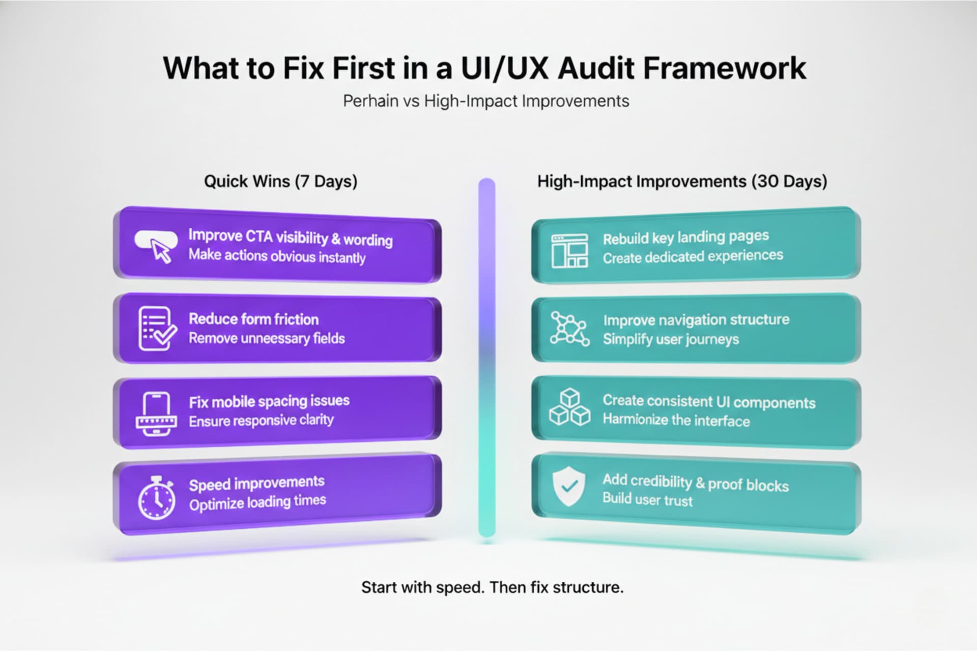
What to fix first (quick wins vs deeper improvements)
You don’t need a full redesign to see results. Start with what impacts conversion fastest.
Quick wins you can fix in 7 days
- improve CTA visibility and wording
- reduce form friction
- fix mobile spacing issues
- clean up homepage clarity
- speed improvements (image compression)
- remove distractions and competing CTAs
High-impact improvements in 30 days
- rebuild key landing pages for better flow
- improve navigation structure
- create consistent UI components
- add credibility and proof blocks
- strengthen onboarding and product journey
The goal is to create a smoother path from interest to action.
Simple UI/UX audit tools you can use
You don’t need a complex stack. A basic setup is enough.
Use:
- Google Analytics (drop-off pages, bounce rate, user flow)
- heatmaps for click patterns
- session recordings for behavior
- form tracking for abandonment rates
- simple surveys (“What stopped you today?”)
The best UI/UX improvements come from real user behavior, not guesses.
Conclusion
A UI/UX audit helps you increase conversions by removing friction, improving clarity, and making key actions easier to complete. When users understand what to do, trust what they see, and move through a smoother flow, drop-offs reduce naturally.
If you focus on quick wins first and then improve the full experience step-by-step, your website or app will convert better without increasing ad spend. For businesses improving a product experience, exploring UI/UX design services once you know the gaps can make the fixes faster and more consistent.