Your Landing Page Is Losing Customers. Here's Exactly Why.
By Relish Team
Most landing pages fail not because they look bad — but because they were built to impress rather than to convert.
There's a pattern that shows up across almost every underperforming landing page: strong design, reasonable traffic, weak results. The page looks credible. The product is genuinely good. But visitors arrive, scroll briefly, and leave without doing anything.
The problem is almost never the offer. It's the page.
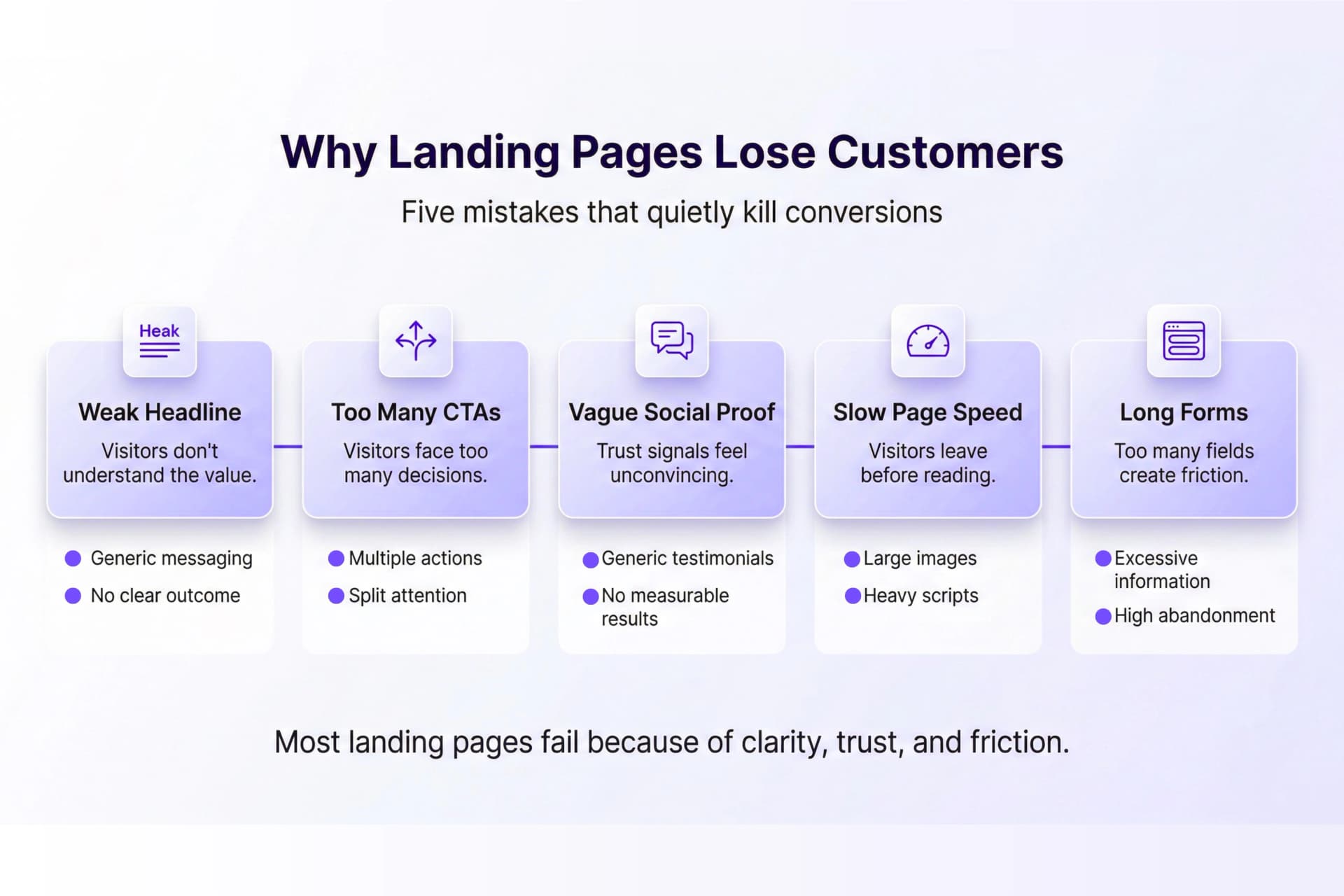
Here's what's actually killing conversions — and what to do instead.
The Headline Isn't Doing Its Job
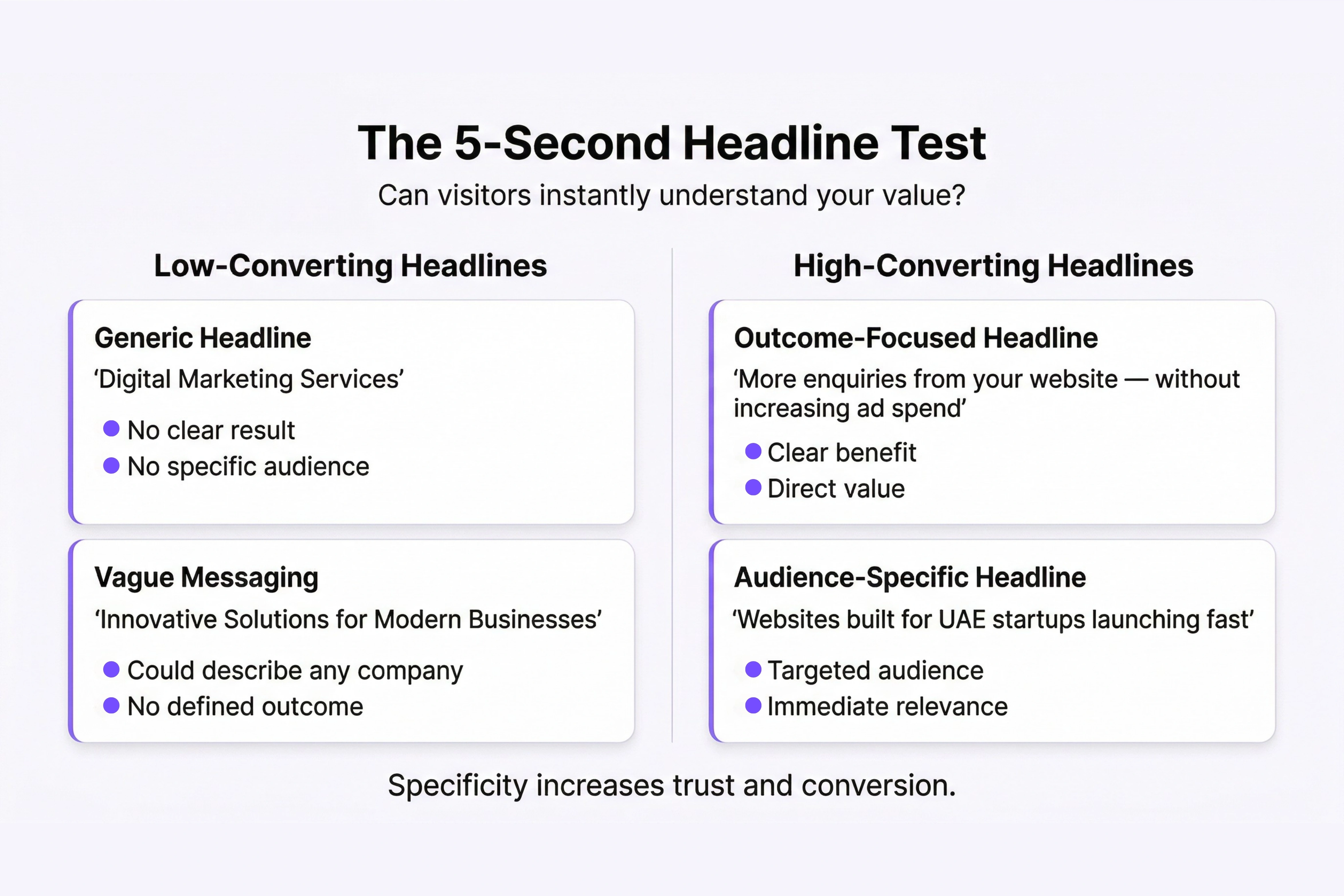
Your headline has one job: tell a visitor within five seconds exactly what they'll get and why it matters to them. Most headlines fail this test entirely.
"Welcome to [Brand Name]" is a greeting, not a value proposition. "Innovative Solutions for Modern Businesses" is a sentence that could describe 40,000 companies. Neither gives a visitor a reason to keep reading.
A headline that converts answers a specific question: What's in this for me, right now? It names the outcome, not the product. It speaks to a problem the visitor already knows they have.
The Fix
Replace category language with outcome language. Instead of "Digital Marketing Services," try "More enquiries from your website — without increasing your ad spend." Instead of "Brand Strategy for Startups," try "A brand that makes investors take you seriously before you've said a word."
The more specific the headline, the higher the conversion rate. Specificity feels like risk. It's actually the opposite.
Too Many Calls to Action
If your landing page asks visitors to book a call, download a guide, watch a video, follow you on Instagram, and read your latest blog post, you've asked them to make five decisions before they've made one.
Decision fatigue is real. When faced with too many options, people choose none. Research consistently shows that landing pages with a single, focused call to action outperform those with multiple competing CTAs — sometimes by more than 200%.The Fix
One page. One primary action. One CTA repeated strategically — at the top, after the social proof, and again at the bottom. If you must offer a secondary option, make it visually smaller and clearly subordinate.
Every element on the page should push in the same direction. The moment you split the visitor's attention, you split your conversion rate.
Vague Social Proof That Convinces Nobody
"Great service!" means nothing. "Trusted by 500+ businesses" with no names attached means almost nothing. Social proof only works when it's specific enough to be believed and relevant enough to apply to the visitor's situation.
The visitor's internal question at this stage is: has someone like me trusted this company and been satisfied? Generic testimonials don't answer that. They just create more doubt.
The Fix
Replace vague praise with specific outcomes. "Great to work with" becomes "We launched in six weeks and had our first client within 10 days of going live." Replace numbers without context with named clients, industries, and measurable results.
And placement matters as much as content. A testimonial buried in the footer is decoration. A testimonial placed directly next to your CTA, or immediately after a bold claim, is a conversion tool.
The Page Loads Too Slowly
A one-second delay in page load time reduces conversions by up to 7%. On mobile — where the majority of web traffic now originates, including in the UAE — a three-second load time is enough to lose most of your audience before they've read a single word.
Slow pages don't just frustrate users. They signal a lack of care. If a business can't be bothered to make its own website fast, what does that suggest about how they'll treat a client's project?
The Fix
Compress images. Reduce scripts. Test your page speed using Google's PageSpeed Insights and treat the result as a commercial metric, not a technical one. A fast page isn't a nice-to-have — it's a prerequisite for everything else working.
The Form Asks for Too Much
You want the lead. You also want their company name, phone number, annual revenue, project timeline, and how they found you. So you put all of that in the enquiry form.
And the visitor, who was ready to reach out, looks at the form and thinks: this feels like a lot. So they close the tab and move on.
Every field you add to a form is friction. Friction kills conversions at the exact moment the visitor has decided to act — which is the worst possible moment to create doubt.
The Fix
For most service businesses, you need three fields at the enquiry stage: name, email, and a brief description of the project. That's it. Qualify further in the first conversation. The goal of the form is to start a dialogue, not complete a briefing document.
The Page Wasn't Built for the Visitor
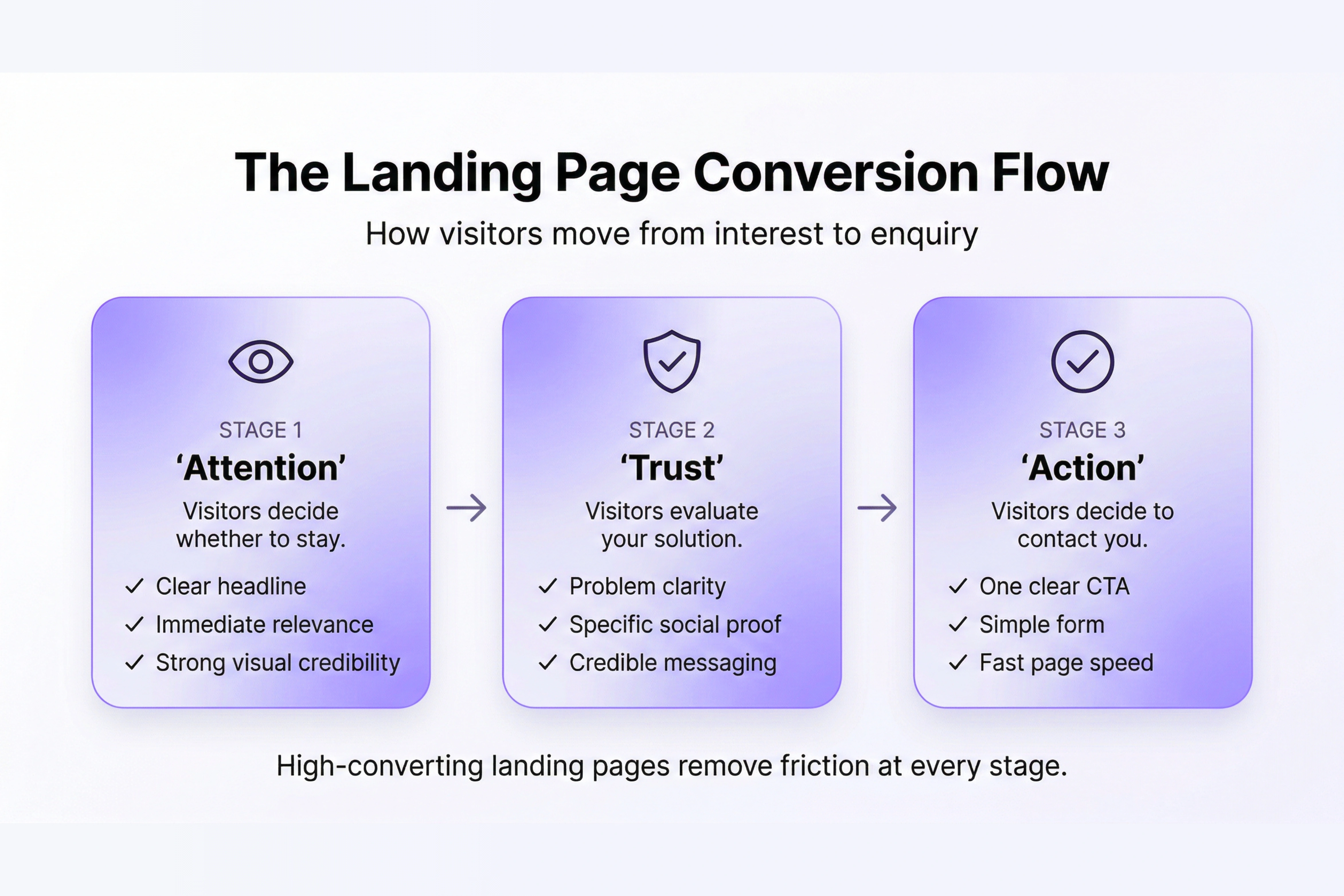
Here's the root cause underneath all of the above: most landing pages are built around what the business wants to say, not what the visitor needs to hear.
The headline talks about the company's history. The copy lists services in the order the business thinks about them, not the order the customer cares about them. The CTA asks for what the business wants, not what feels like a natural next step for someone who arrived thirty seconds ago.
High-converting landing pages are built visitor-first. They open with the problem. They progress through the solution. They address objections before they're raised. They ask for action at the moment the visitor is most ready — not at the moment that's most convenient for the business.
This kind of thinking starts before design, not after. It lives in strategy, in understanding the audience deeply enough to know exactly what they need to see at every point in the page.
Because a landing page that looks good but doesn't convert isn't an asset — it's an expensive way to send traffic to a dead end.